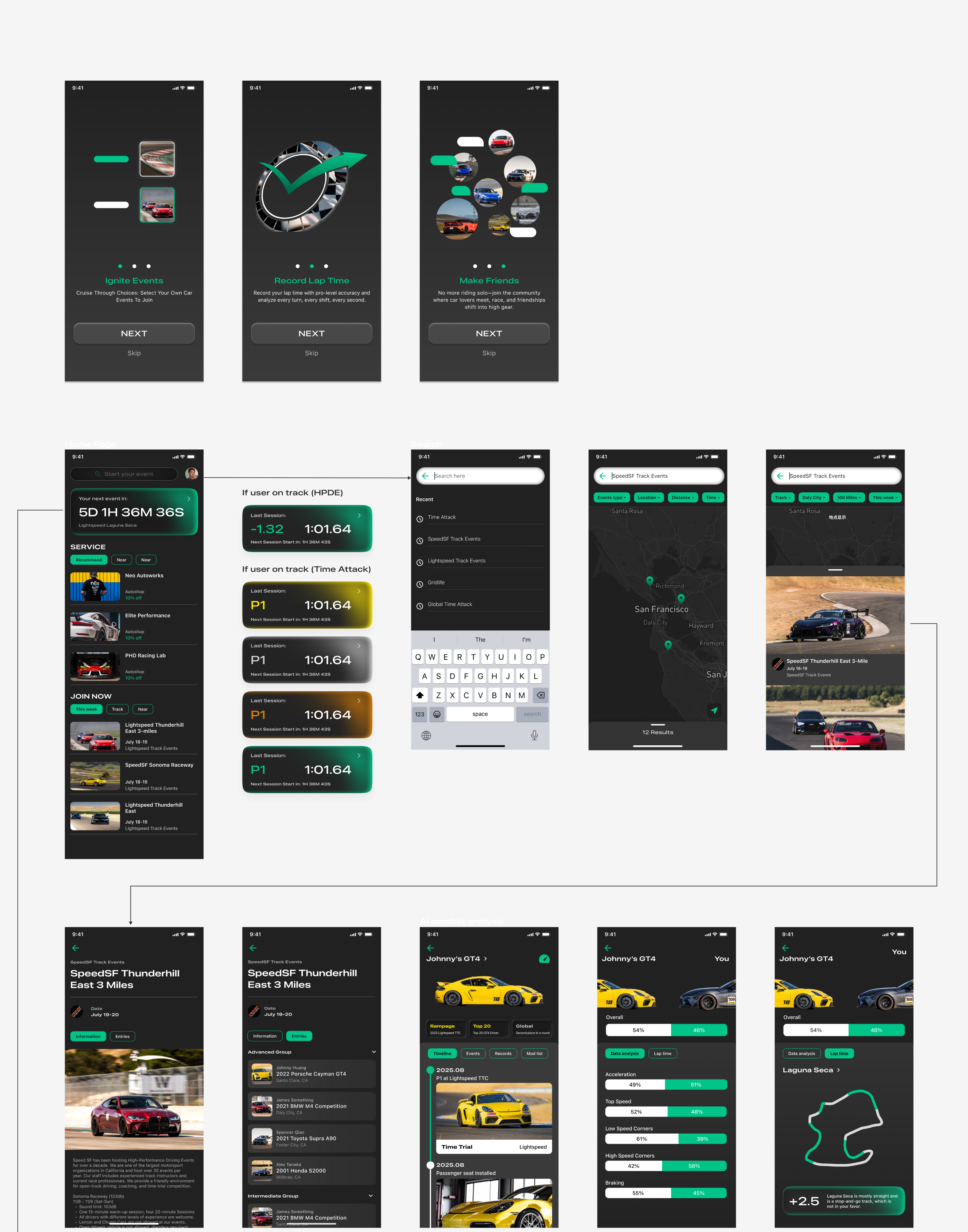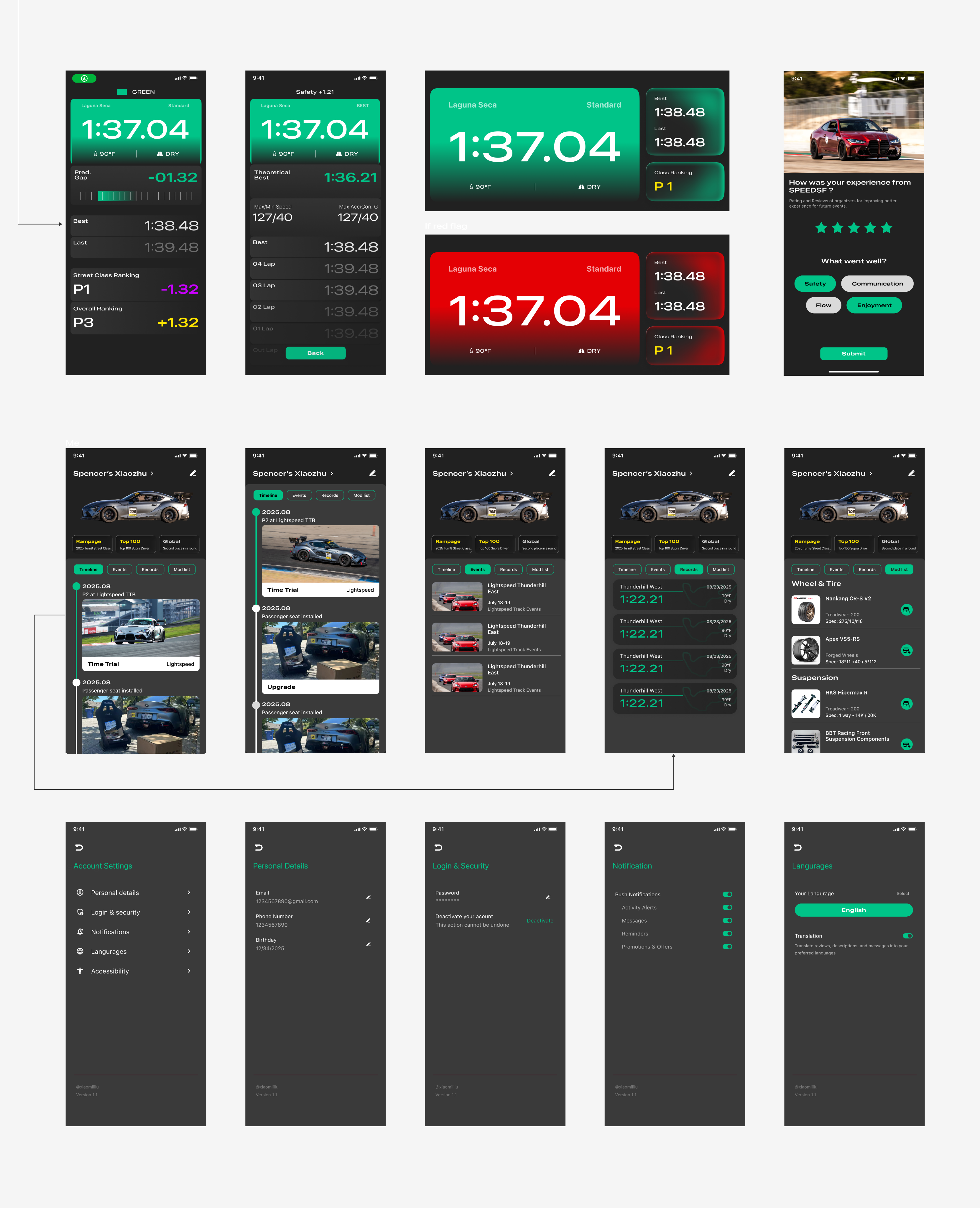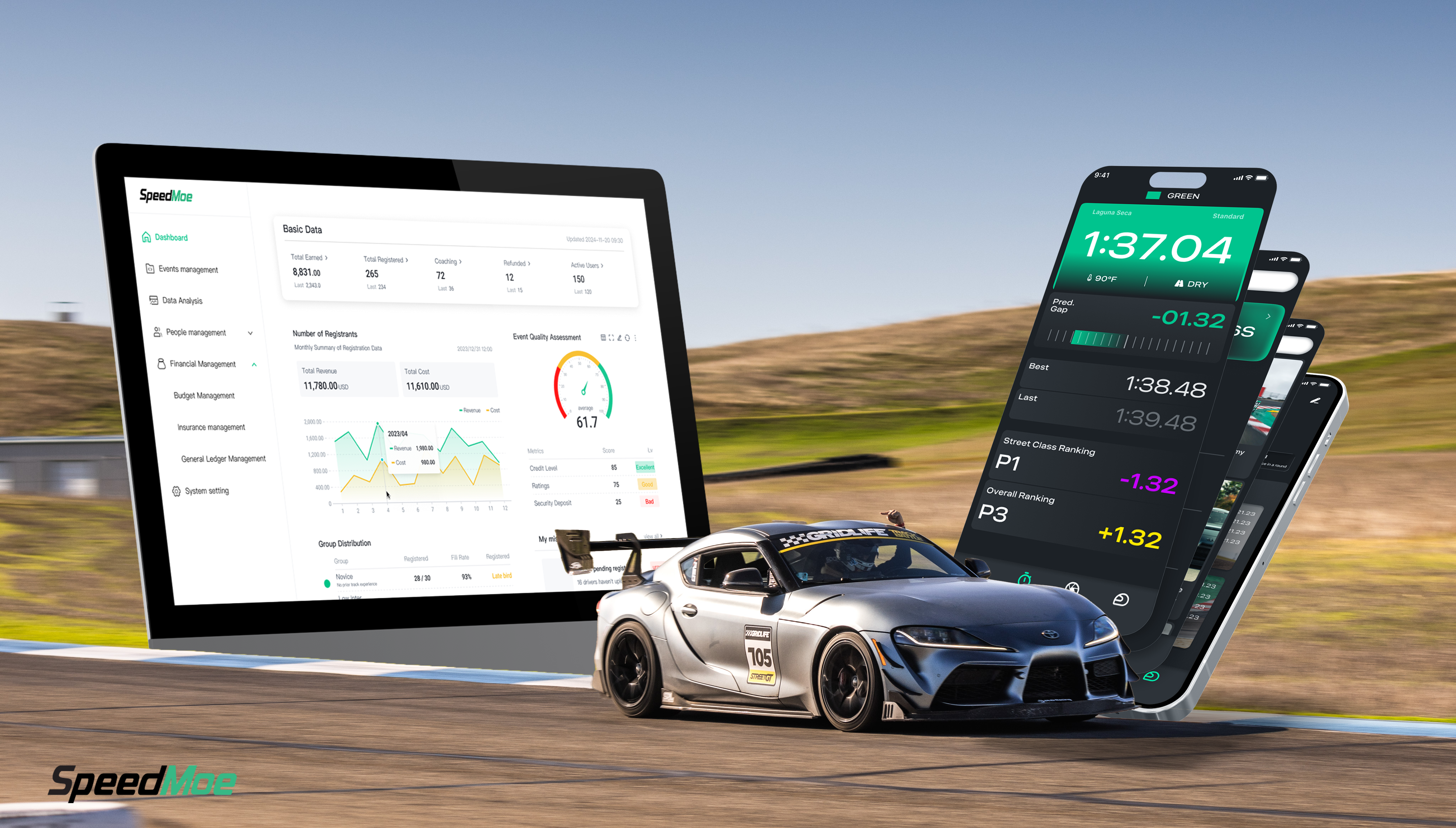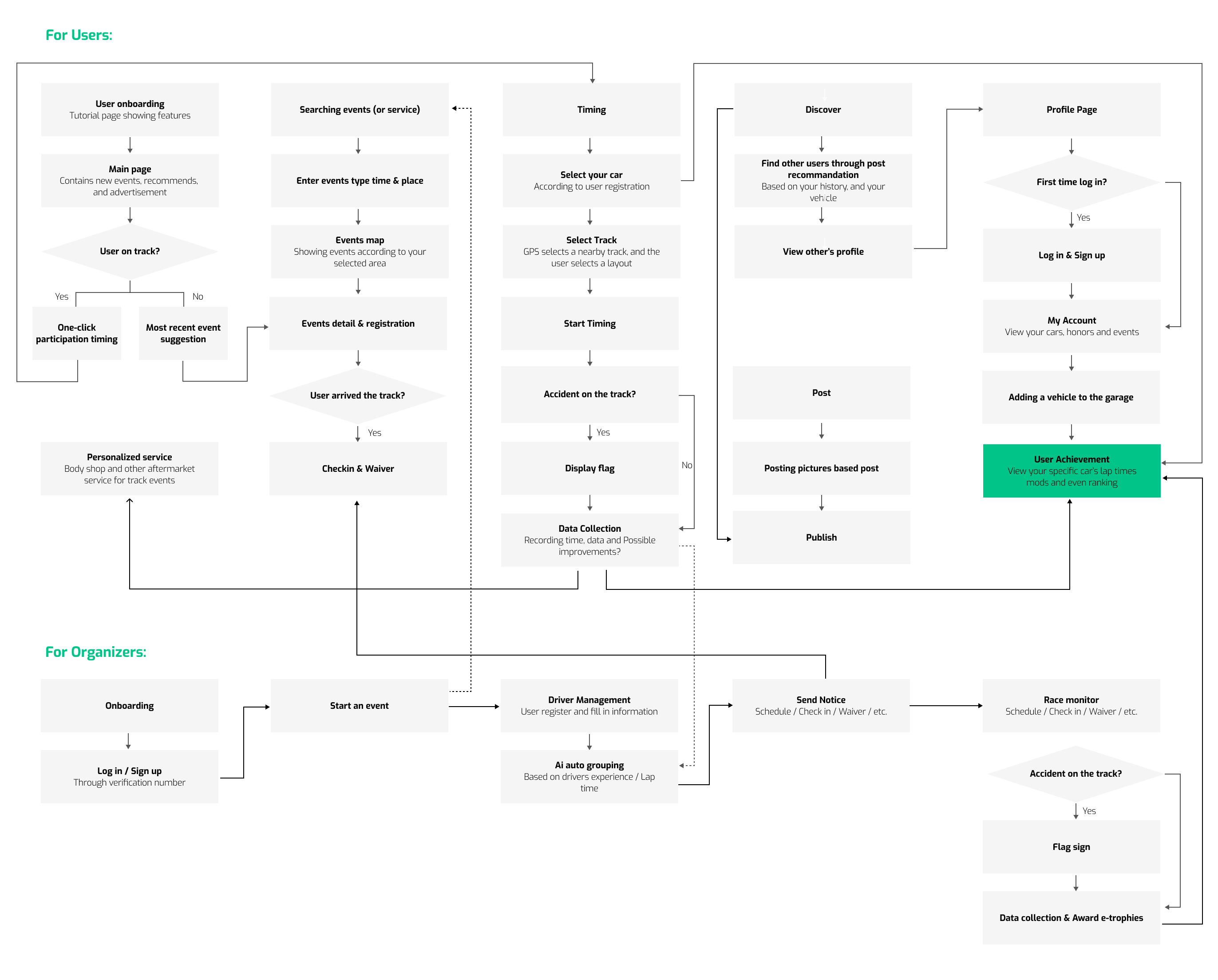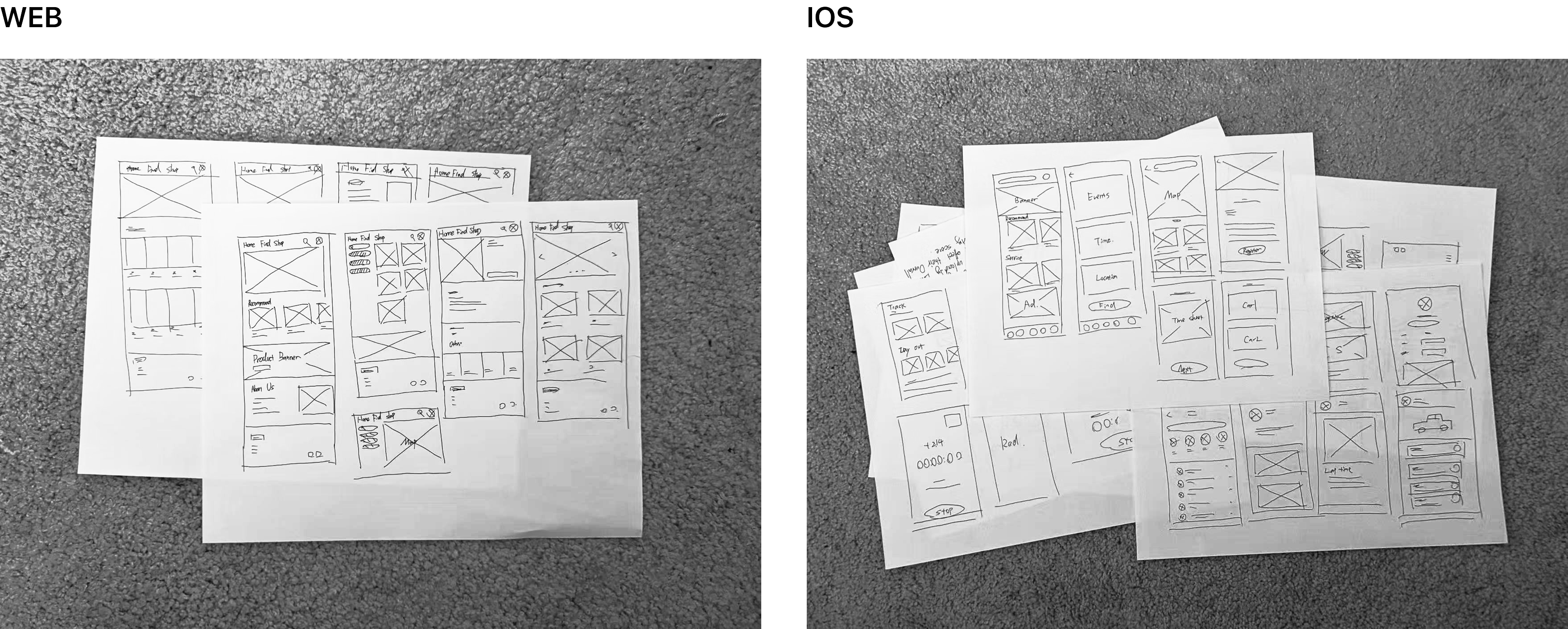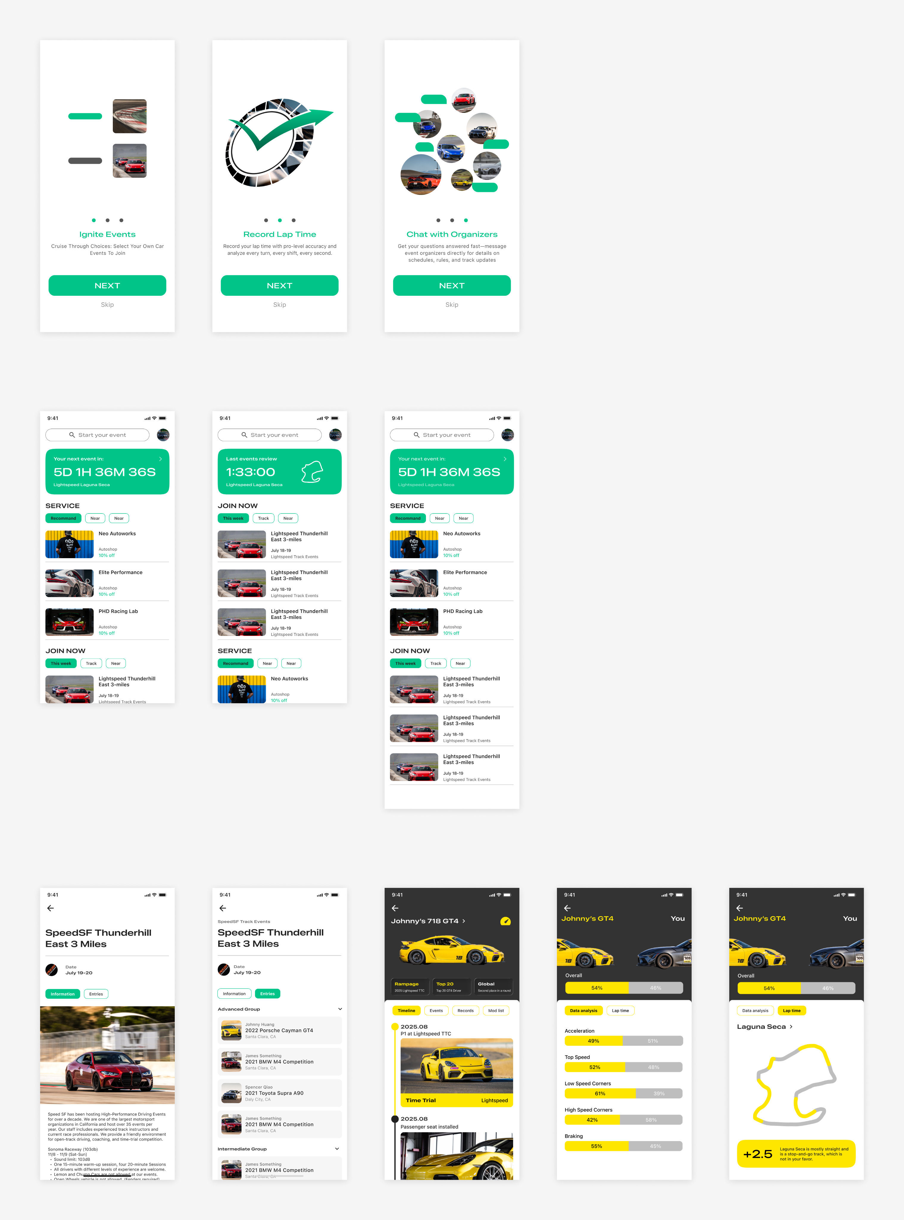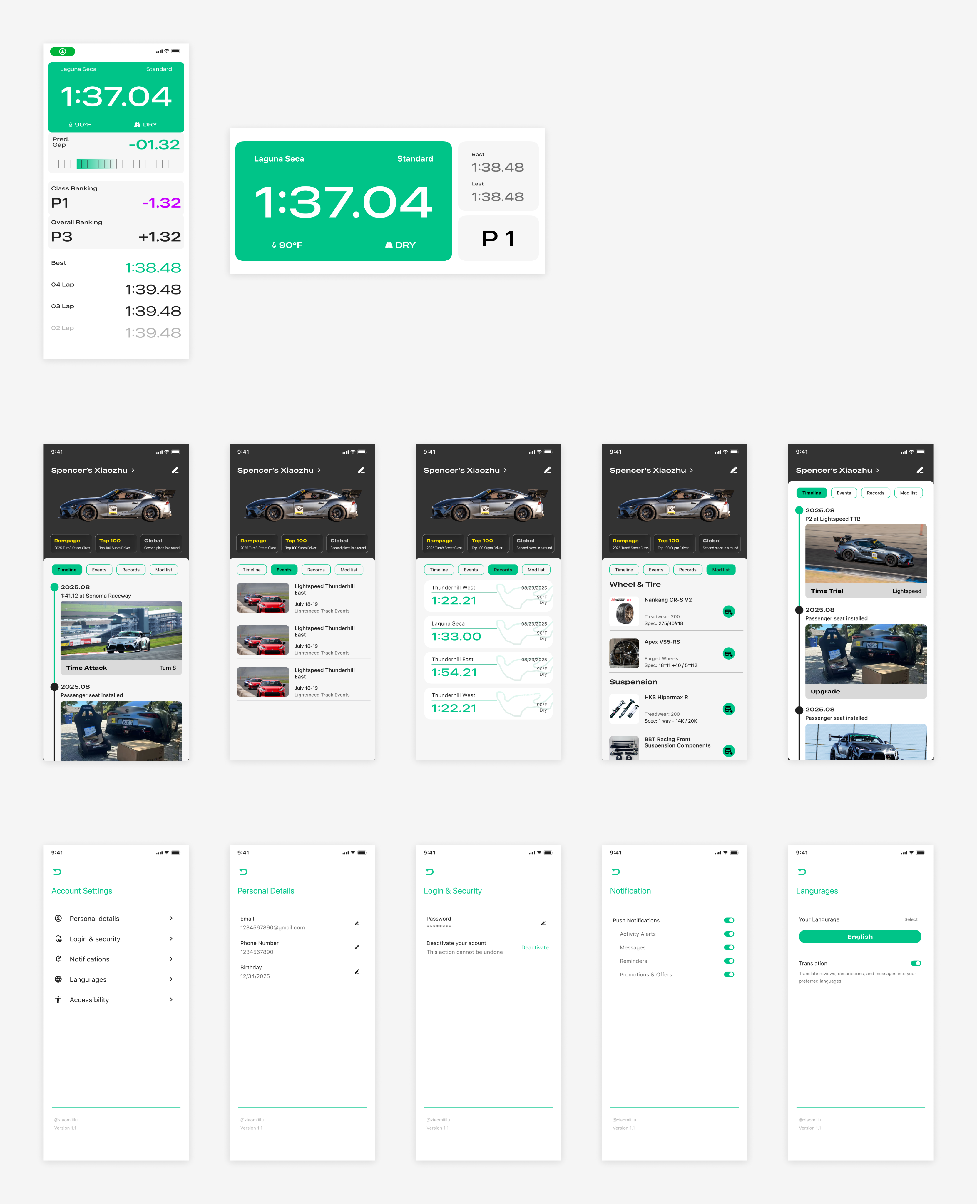
HIGH-FIDELITY PROTOTYPE
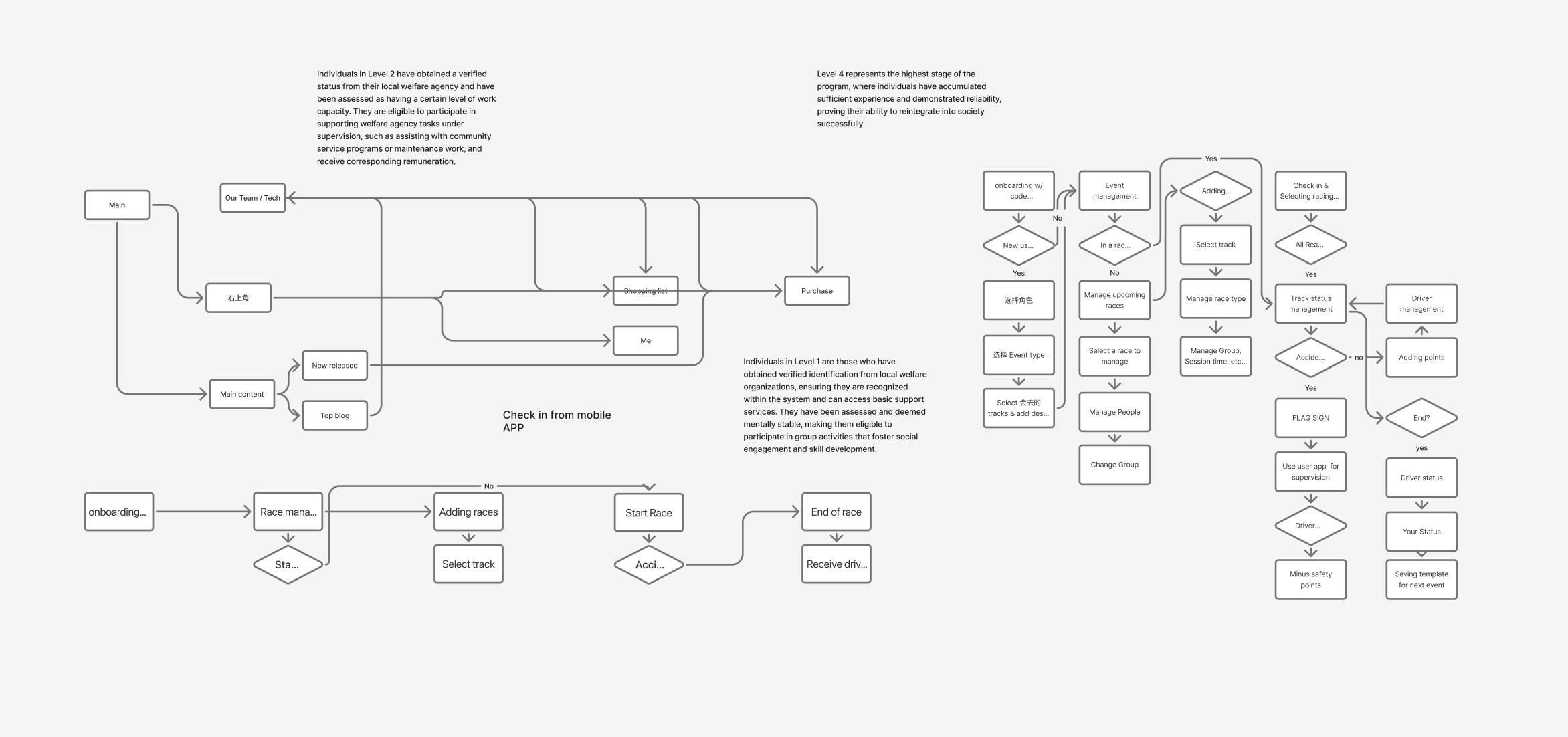
Final UX Flow Overview
(Web + App + Track Integration)
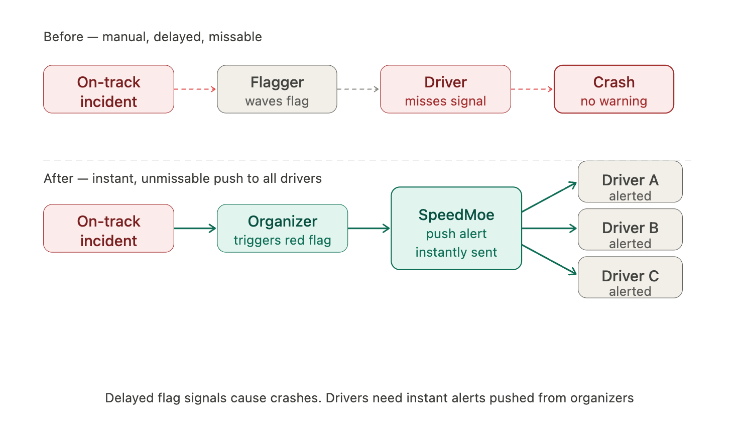
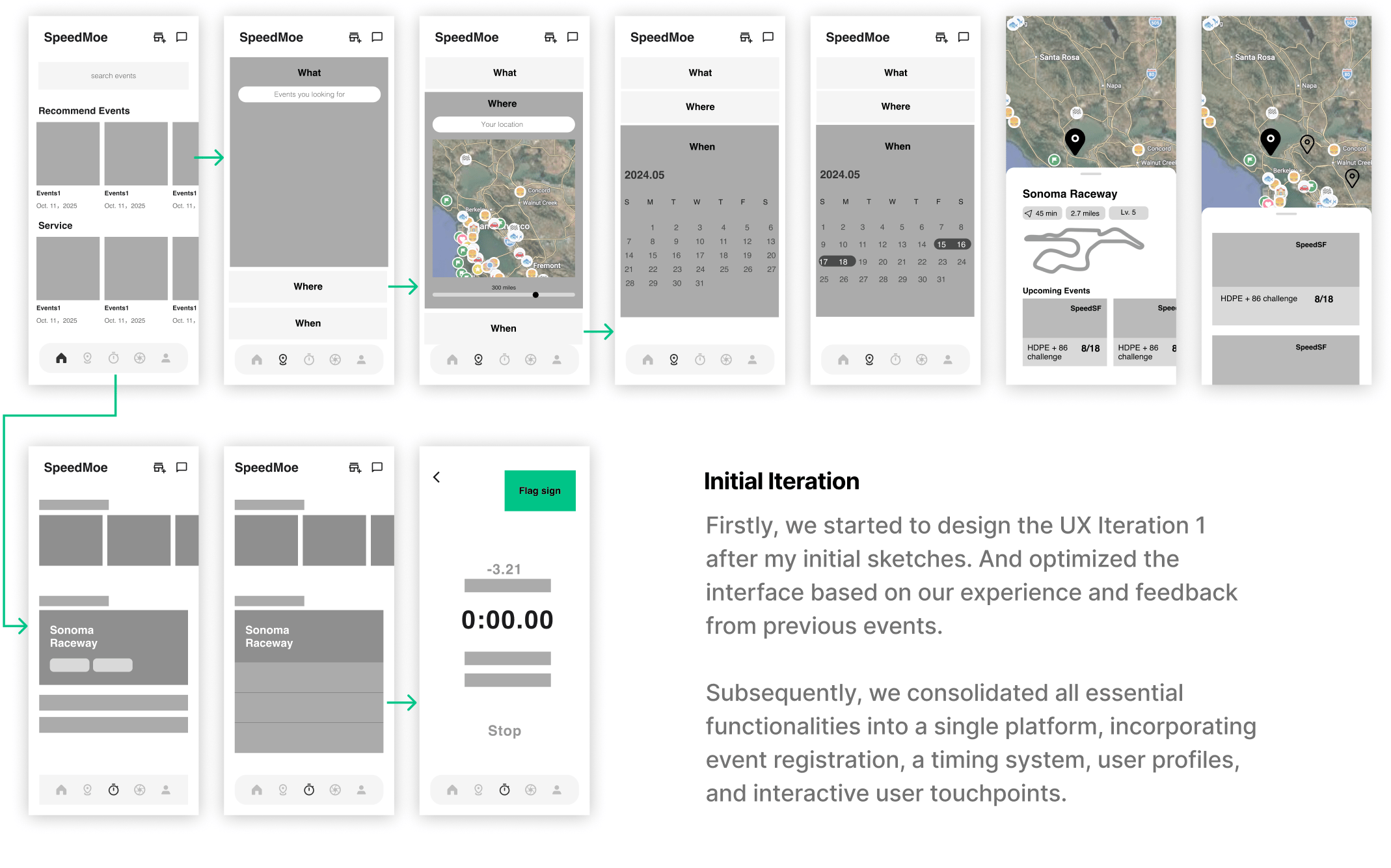
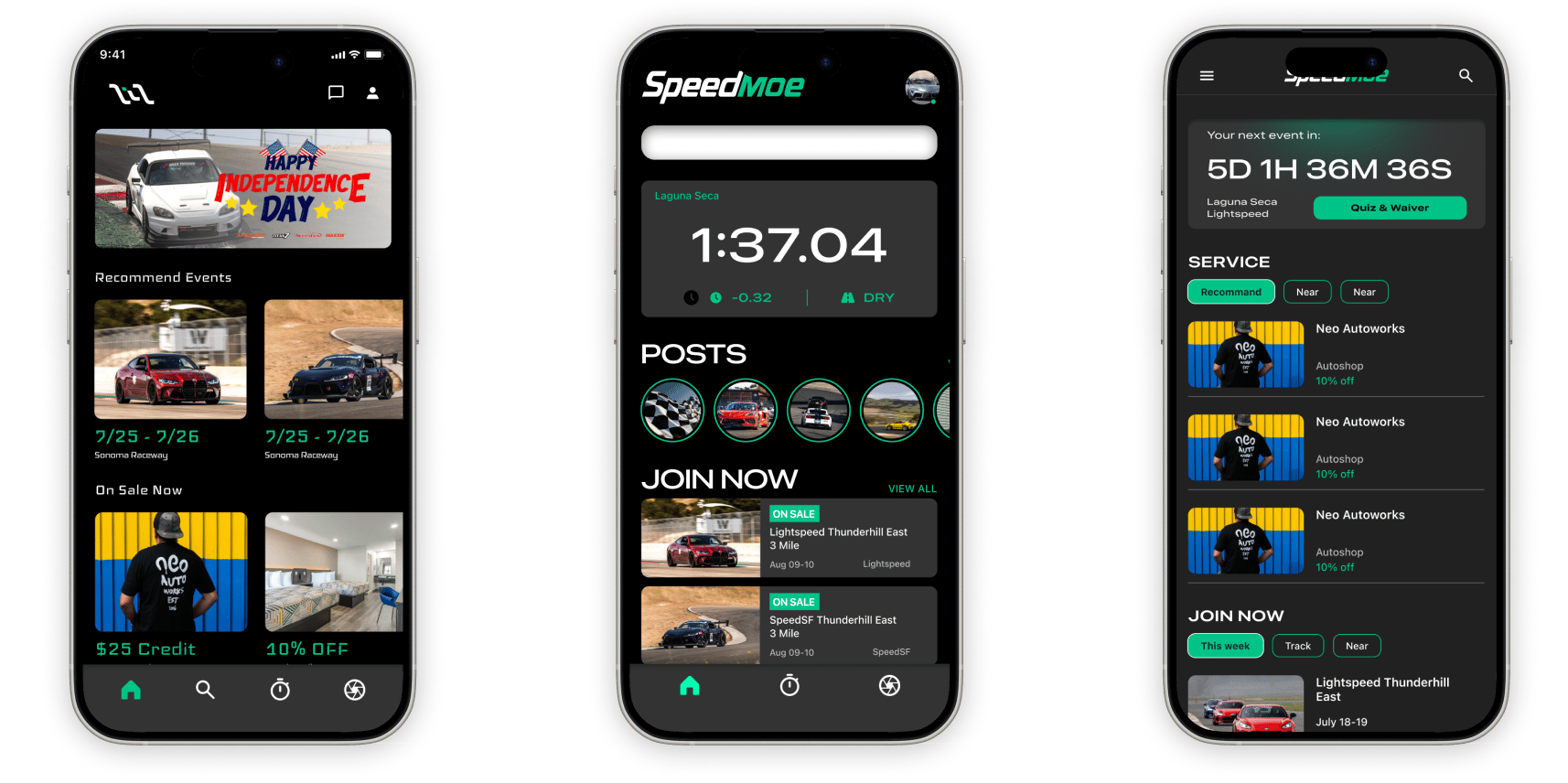
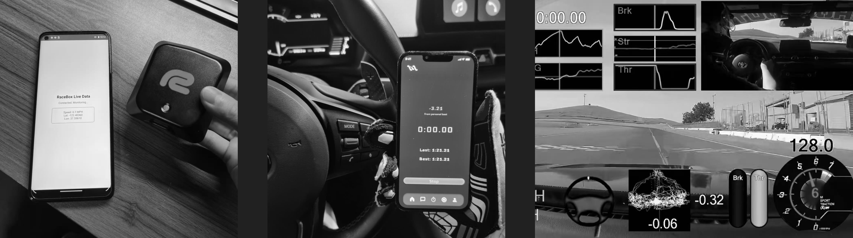
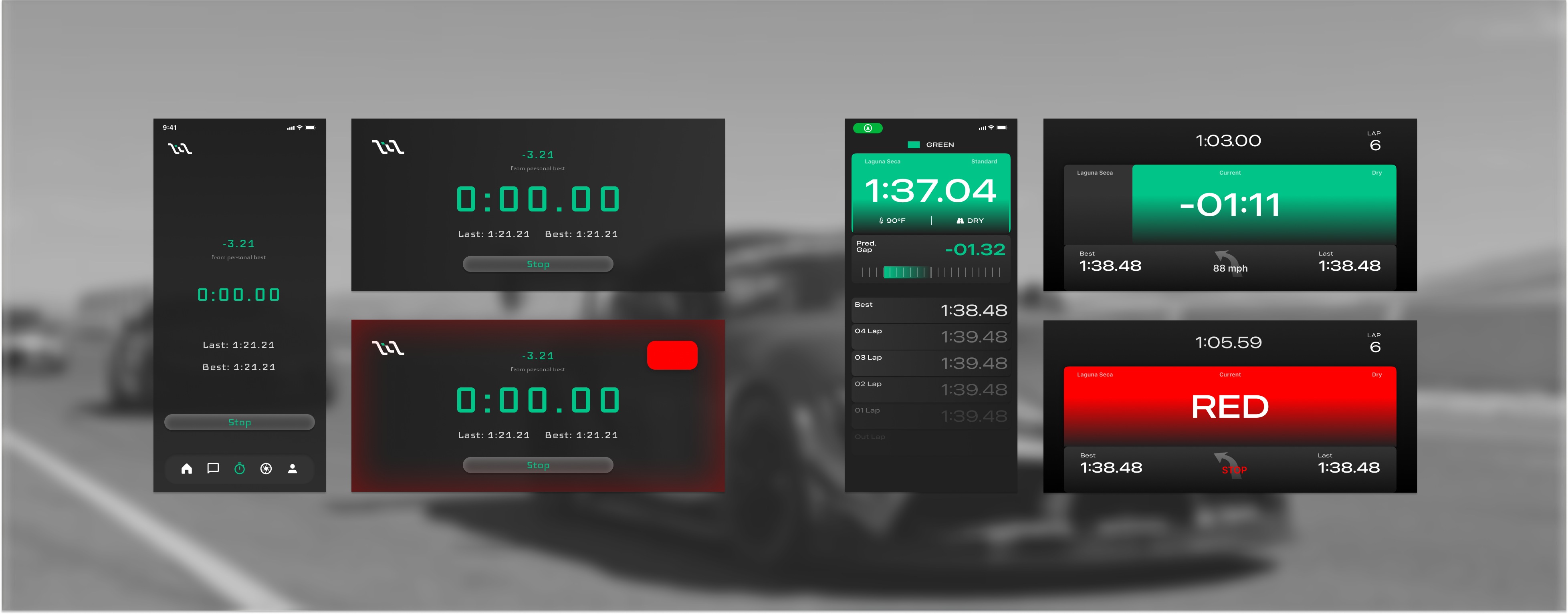
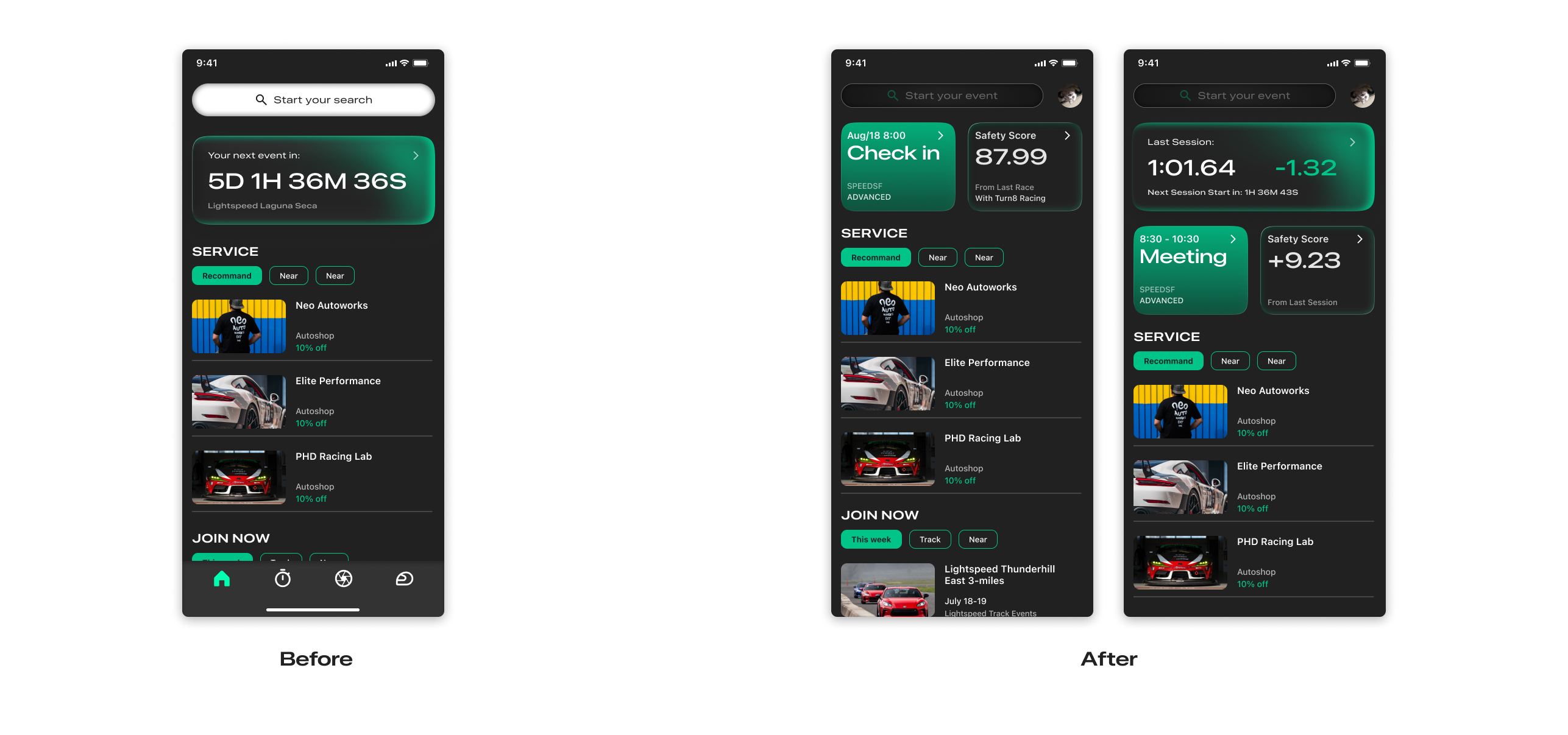
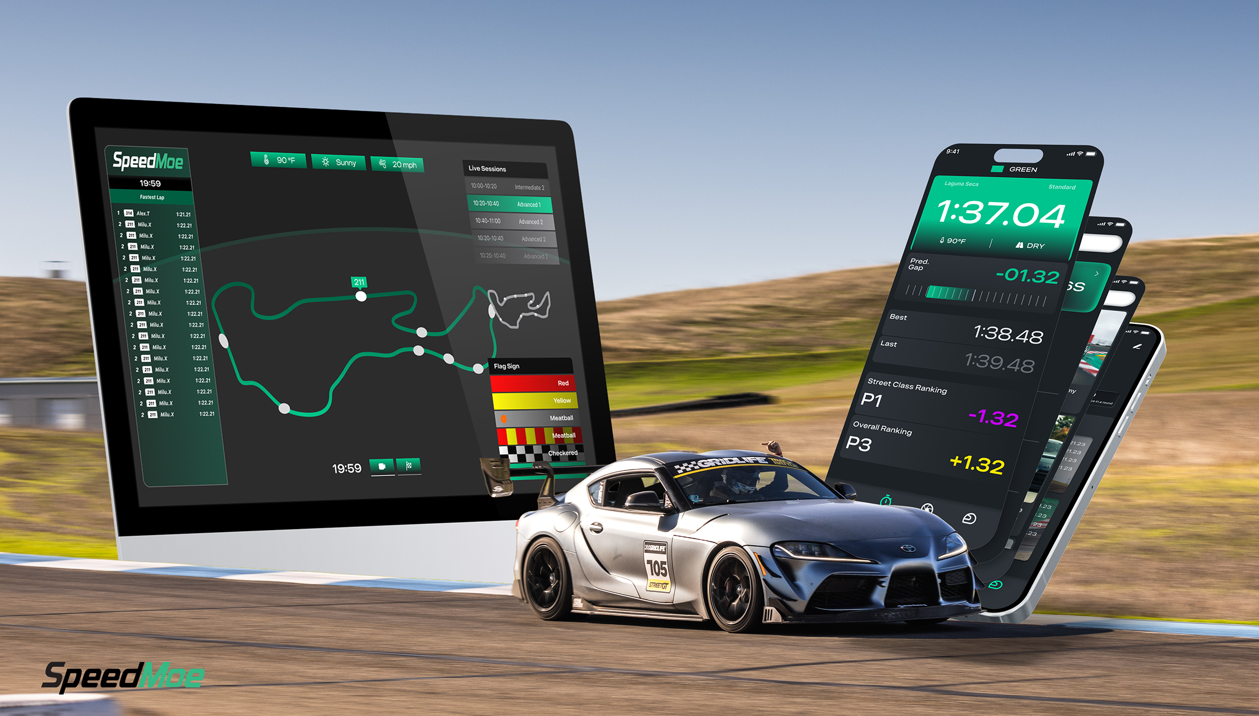
The final UX flow was built around real track day needs—from registration to live data tracking and post-session services. We prioritized clarity, responsiveness, and ease of use, especially during high-pressure moments on track.For users, the design blends performance data, profile mods, and social features to create a connected, rewarding experience. It’s more than just a timing tool—it’s a racing companion powered by data, reputation, and engagement.
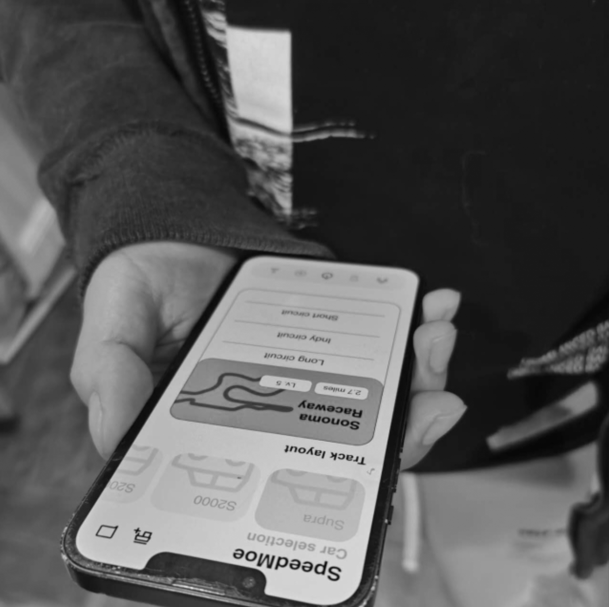
Mobile (User)
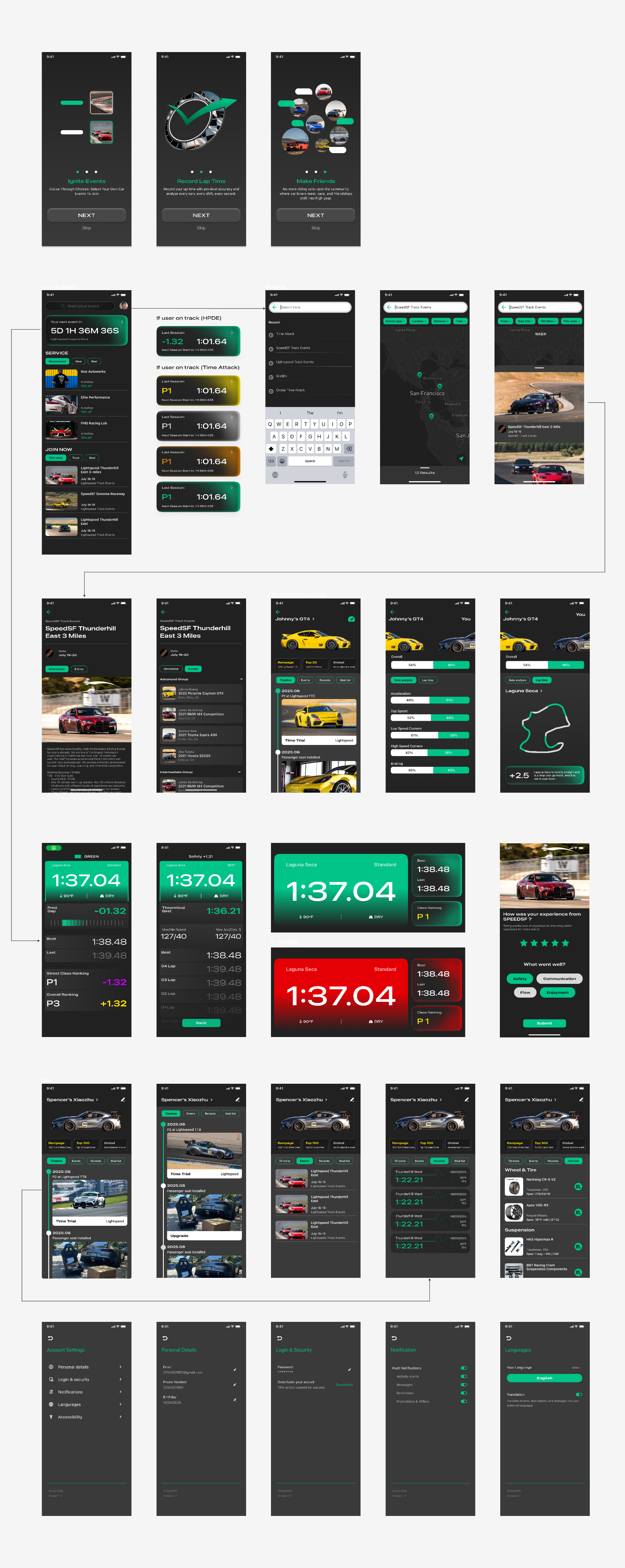
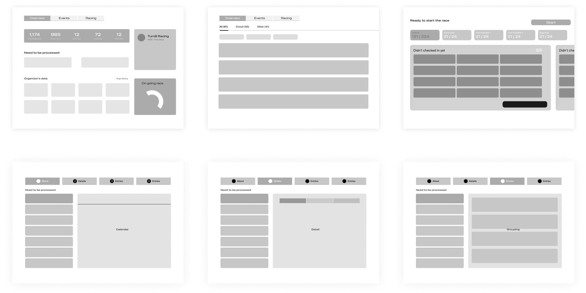
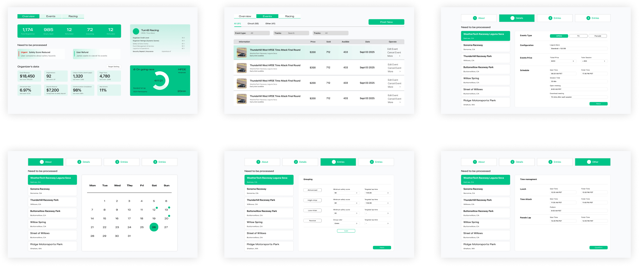
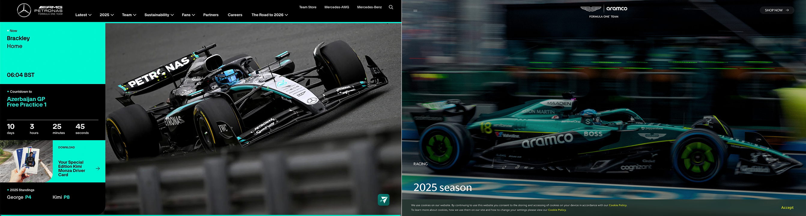
Website (Organizers)
Mobile (User light)